Graphic Design Case Study

A study of layout, type, color, and visual hierarchy, showing how I translate a creative brief into a finished identity system.


The Problem

The client needed a brand identity that felt warm and trustworthy but also distinct enough to compete in a crowded market. Their existing visuals were inconsistent, the typography was generic, and color choices shifted across platforms.

The Solution

I built a small design system, a refined logomark, a paired type system (serif headline + sans body), a calm color palette, and a consistent layout grid. Every deliverable was checked against the system so the brand reads the same in print, web, and social.

Process

1. Discover

Brief, audience, references, mood

2. Direct

Type, color, grid, voice

3. Design

Iteration, refinement, review

4. Deliver

Final assets, brand kit, guidelines

Selected Work

Graphic design exploration 1

Identity Exploration

Early concept direction focused on color and shape relationships.
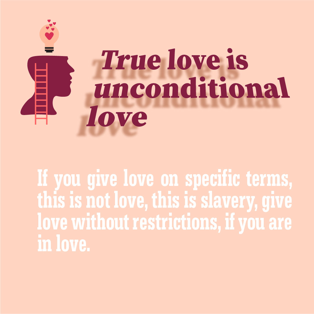
Graphic design exploration 2

Type & Voice

Pairing a refined serif headline with a clean, modern sans body.

Graphic design exploration 3

Color System

A grounded palette built around warmth, contrast, and accessibility.

Graphic design exploration 4

Final Application

The system applied across print, social, and web touchpoints.

Result

A cohesive brand that reads consistently across every surface, clearer decisions for the client, faster reviews, and a system that scales as the business grows.

Start a Project Back to Graphic Design